In September of 1861, the U.S. Coast Survey published a large map, just under three feet square, titled a “Map showing the distribution of the slave population of the southern states of the United States.” Based on the population statistics gathered in the 1860 census, and certified by the superintendent of the Census Office, the map depicted the percentage of the population enslaved in each county.
The map showed at a glance the large-scale patterns of slavery in the American South: the concentrations of slavery in eastern Virginia, in South Carolina, and most of all along the Mississippi. It also repaid closer examination, since each county was labeled with the exact percentage enslaved. The map of slavery was one of many thematic maps produced in the nineteenth century United States. As Susan Schulten has shown, this particular map was used by the federal government during the Civil War, and it was a favorite of Abraham Lincoln’s.
Though such thematic maps, in particular of slavery, have their origins in the nineteenth century, the technique is useful for historians. As I see it, one of the main problems for the historians’ method today is the problem of scale. How can we understand the past at different chronological and geographical scales? How can we move intelligibly between looking at individuals and looking at the Atlantic World, between studying a moment and studying several centuries? Maps can help, especially interactive web maps that make it possible to zoom in and out, to represent more than one subject of interest, and to set representations of the past in motion in order to show change over time.
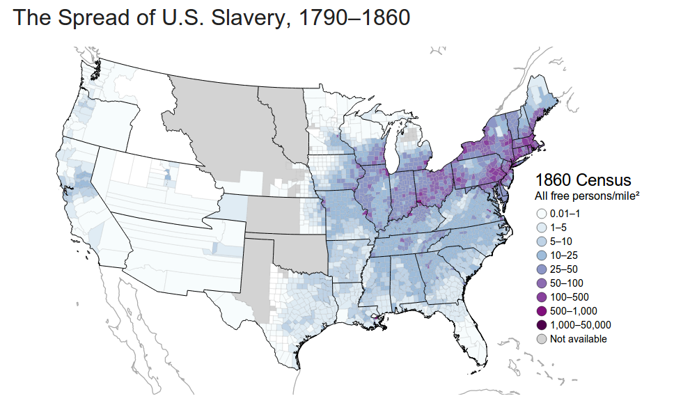
I have created an interactive map of the spread of slavery in the United States from 1790 to 1860. Using Census data available from the NHGIS, the visualization shows the population of slaves, of free African Americans, of all free people, and of the entire United States. It also shows those subjects as population densities and percentages of the population. For any given variable, the scales are held constant from year to year so that the user can see change over time. You can use the map for yourself, and I’ve also written briefly about what the map shows below. Historians have of course often made use of maps of slavery, in particular maps based on the Census, in support of their arguments. What I’ve tried to do in this interactive map is make it possible for users (including me) to explore the census data in support of making historical arguments.