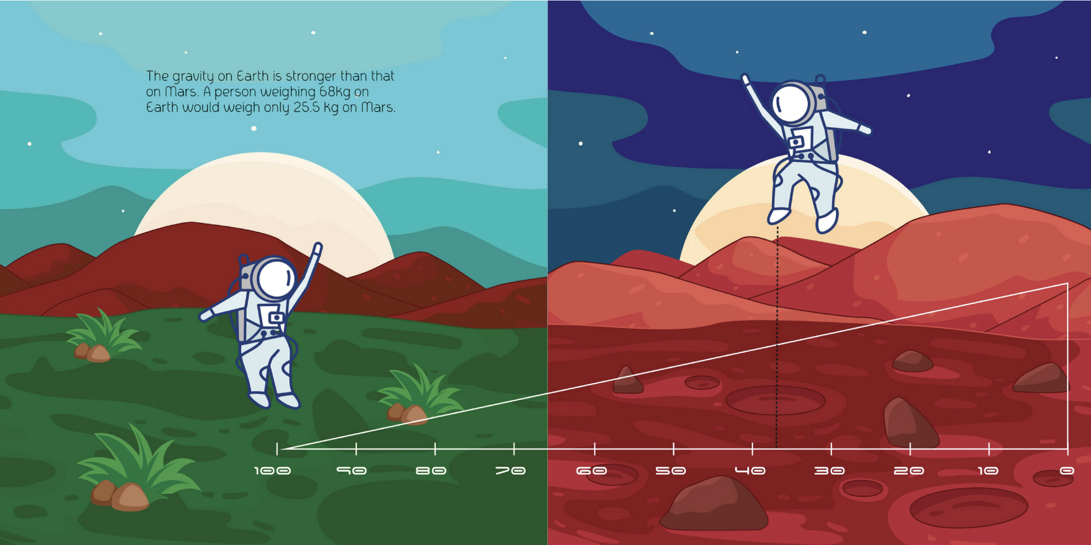
Editors’ Summary: Rhea Shukla’s work combines graphic design seamlessly into data processing and visualization. This project reminds us about visual accessibility: information needs to be made easy for members of the public (and not just for academics) to grasp and understand. This is where skills in graphic design, UI/UX development, and user research come into play. Unfortunately, especially in academia, advancements in these areas seem to be shadowed by so-called “production of knowledge.” Shukla’s project reminds us that the way we present “knowledge” is, in a way, “knowledge” itself.
Editors’ Choice: Designing Mars: Transforming Scientific Data Into Human Understanding

