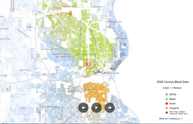
The history of redlining matters. For decades, the government sponsored Home Owners’ Loan Corporation created maps that defined African American neighbourhoods as high risk, which resulted in people not having access to a Federal Housing Administration insured mortgage in these districts. Ta-Nehisi Coates used the research…to develop the case for reparations in his 2014 cover story in the Atlantic. He convincingly argued that long after the end of Slavery, government policy actively limited economic opportunities for African Americans, created segregated cities and the significant gap in wealth between white and black Americans: “From the 1930s through the 1960s, black people across the country were largely cut out of the legitimate home-mortgage market”… Recent proposed legislation confirms the combined power of an explosive cover story in the Atlantic and these interactive maps. A number of senators and congressmen have introduced a bill to prevent federal funding from supporting the creation of data used by the Racial Dot Map or Mapping Segregation maps in the future. The National Council on Public History (NCPH) warned on February 27 that “S.103 threatens digital history initiatives around race”. They quote the bill, which is very blunt in its intent: “no Federal funds may be used to design, build, maintain, utilize, or provide access to a Federal database of geospatial information on community racial disparities or disparities in access to affordable housing.”
Read full post here.