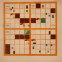
This talk departs from a seemingly simple question: “What is the story we tell about the origins of modern data visualization?” And as a set of follow-ups, “What alternate histories might emerge, what new visual forms might we imagine, and what new arguments might we make, if we told that story differently?” To begin to answer these questions, I’ll focus on the work of one visualization designer from the nineteenth century, Elizabeth Palmer Peabody, whose images are rarely considered in the standard story we tell about the emergence of modern visualization techniques. When they are mentioned at all, they are typically described as strange–and sometimes even as failures.
Read full post here.

