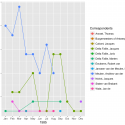
Quantitative research often begins with the humble process of counting. Historical documents are never as plentiful as a historian would wish, but counting words, material objects, court cases, etc. can lead to a better understanding of the sources and the subject under study. When beginning the process of counting, the first instinct is to open a spreadsheet. The end result might be the production of tables and charts created in the very same spreadsheet document. In this post, I want to show why this spreadsheet-centric workflow is problematic and recommend the use of a programming language such as R as an alternative for both analyzing and visualizing data. There is no doubt that the learning curve for R is much steeper than producing one or two charts in a spreadsheet. However, there are real long-term advantages to learning a dedicated data analysis tool like R. Such advice to learn a programming language can seem both daunting and vague, especially if you do not really understand what it means to code. For this reason, after discussing why it is preferable to analyze data with R instead of a spreadsheet program, this post provides a brief introduction to R, as well as an example of analysis and visualization of historical data with R.
The draw of the spreadsheet is strong. As I first thought about ways to keep track of and analyze the thousands of letters in the Daniel van der Meulen Archive, I automatically opened up Numbers — the spreadsheet software I use most often — and started to think about what columns I would need to create to document information about the letters. Whether one uses Excel, Numbers, Google Sheets or any other spreadsheet program, the basic structure and capabilities are well known. They all provide more-or-less aesthetically pleasing ways to easily enter data, view subsets of the data, and rearrange the rows based on the values of the various columns. But, of course, spreadsheet programs are more powerful than this, because you can add in your own programatic logic into cells to combine them in seemingly endless ways and produce graphs and charts from the results. The spreadsheet, after all, was the first killer app.
With great power, there must also come great responsibility. Or, in the case of the spreadsheet, with great power there must also come great danger. The danger of the spreadsheet derives from its very structure. The mixture of data entry, analysis, and visualization makes it easy to confuse cells that contain raw data from those that are the product of analysis. The nature of defining programatic logic — such as which cells are to be added together — by mouse clicks means that a mistaken click or drag action can lead to errors or the overwriting of data. You only need to think about the dread of the moment when you go to close a spreadsheet and the program asks whether you would like to save changes. It makes you wonder. Do I want to save? What changes did I make? Because the logic in a spreadsheet is all done through mouse clicks, there is no way to effectively track what changes have been made either in one session or in the production of a chart. Excel mistakes can have wide-ranging consequences, as the controversy around the paper of Carmen Reinhart and Kenneth Rogoff on national debt made clear.
Read the full post here.

