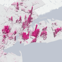
Vox data journalist Alvin Chang, an alum of the Boston Globe and ESPN, has been writing stories about segregation for most of his career. Earlier this year, Chang looked at segregation in both the workplace and the home in his story “American segregation, mapped at day and night.”
Using data provided by researchers at Cornell and Penn State, Chang created an immersive story with interactive and visual features that blended historical footage and three-dimensional visualizations to illuminate just how segregated America still is.
Storybench sat down with Chang to talk about how this story came about and the steps he took to create an immersive piece.
How did you come up with the idea for this story?
I’ve written a few pieces on segregation. It’s often about racial segregation in housing and in schools as those are kind of the two biggest examples of American segregation that was engineered by the federal government. So, I’ve done quite a bit of work – especially in the school segregation space and especially in the mapping and the analysis of this data.
[For this story,] I actually got a DM on Twitter from one of the researchers – his name is Matthew Hall – and I think I cite him in the piece. He was like ‘Hey! Me and my colleagues have this really interesting piece of research. I’m curious if you want to look at it?’ and I jumped on a call with him and I said ‘Yeah, definitely! Especially if you’re willing to share some data with me.’ So, he actually reached out with some research he had and a lot of the time these researchers have a lot of data behind their papers but their data is stuck behind, essentially, a PDF or an academic journal and no one really gets to see what their findings are and so when I see examples of this I jump on it. I’m like ‘OK. I definitely think these people did work that is incredibly important and my job is to try to help readers understand the findings and maybe personalize it to their actual geography or their situation.’ As soon as I realize this was one of those projects – I talked with Matt, made sure that everything that needed to be agreed upon was agreed upon, and then he shared his data with me. From there, I just started mapping and a lot of the times the narrative that journalists want to tell isn’t clear. It’s not clear from the research paper, you kind of have to dig through to figure out how to tell the story more clearly and so one of the things that I realized I needed to do is call this ‘segregation in day and night;’ versus what they look at work versus at home. You know, most people are at home during the night and at work during the day so the idea was if we could give this a time element it might help people better understand what they’re looking at.

