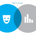
While storytelling can take on many forms and span several disciplines, the techniques and methods we use to tell good stories are fairly similar. Understanding those similarities and what makes a particular story effective on a particular medium can help us become better storytellers. There are certain tricks to improv comedy, for example, that can help us better visualize data.
For both data visualization and improv, the storyteller is inviting an audience into an artificial world. This is a big ask. We’re asking our audience to suspend their understanding of reality for a moment and accept new rules and conditions. For example, when an actor walks on stage, arms outstretched, complaining about the imaginary fishbowl she’s carrying that’s brimming with water, the actor is asking the audience to picture a fishbowl in her hands. What’s more, she has to account for the fishbowl for the entire scene — is she holding it the whole time, is water spilling out of it at all, does she ever put the bowl down, or if it breaks, what happens to the fish?
When we visualize data, we are doing the same thing. We are asking our audience to understand shapes and forms on a digital screen to be something other than what they are. We do this by constructing the world within which these shapes exist — as well as the rules that govern them. We create space with coordinates and maybe gravity — a bar chart, for example, establishes a “ground” and the bars themselves are stacked piles or filled cylinders. This gives the height of the bars meaning.
An important thing we can learn from improv comedy is that we must maintain the logic of the environment we’ve established. If the actor on stage forgets she’s holding a fishbowl and slowly drops her arms as the scene progresses, the scene is ruined. The audience’s trust is lost. The world the actors have asked the audience to imagine has been broken.
Read the full post here.

